We helped 75+ brands generate $1.56M+ in revenue. Average ROI: 240% in Year 1
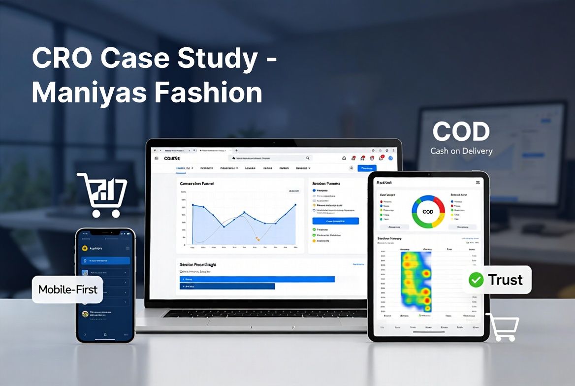
Microsoft Clarity deep-dive on a Pakistan fashion brand uncovered critical friction — free shipping mismatch, cart drawer failures, and mobile UX breakdowns. Full CRO wireframe delivered in 5 days.
Maniyas was already running profitable Meta Ads at 6.94x ROAS (see our Maniyas Ads case study). But something was off: the ads were working, the traffic was coming, but the website wasn't converting at its potential. ATC rate was 3.1% (below the 5-10% fashion benchmark), and 77% of people who added to cart never made it to checkout. The site had just been relaunched 3 days earlier, and Microsoft Clarity was installed. We had fresh behavioral data to work with.
26 sessions added to cart. Only 6 reached checkout. That's 20 potential buyers lost between cart and checkout. The cart drawer was the problem — users couldn't find the checkout button, the drawer didn't show order totals clearly, and on mobile (87% of traffic), the drawer covered the entire screen with no visible "Proceed to Checkout" CTA.
The homepage promised free shipping at Rs 3,499. But product pages showed different shipping costs. The cart showed a third number. Customers saw conflicting information at 3 different touchpoints. In a COD-heavy Pakistan market where customers are extremely price-sensitive, this inconsistency kills trust and conversions instantly.
Session recordings showed users scrolling up and down repeatedly — a classic sign of searching for information they can't find. Missing: per-tee price breakdown (customers couldn't calculate value of the Pack of 5 at Rs 2,999 = Rs 600/tee), size chart visibility, color selection UX, and trust signals for COD buyers.
Clarity dead click data showed users clicking on product images expecting zoom, clicking on color swatches that weren't functional, and clicking on the "Open Parcel" policy text expecting more information. Every dead click is a micro-frustration that erodes buying intent.
Font sizes below 16px on key product info. Tap targets smaller than 44px on CTAs. Cart drawer unusable on small screens. ATC button not sticky — users had to scroll back up to add to cart after reading product details. For a site where nearly 9 out of 10 visitors are on mobile, these aren't minor issues — they're revenue killers.
| Funnel Stage | Sessions | % of Total | Drop-off |
|---|---|---|---|
| Total Sessions | 840 | 100% | |
| Product Page Views | ~520 | 62% | 38% bounced before product |
| Add to Cart | 26 | 3.1% | Below 5-10% benchmark |
| Begin Checkout | 6 | 0.7% | 77% lost at cart |
| Purchase | 0 detected | Tracking gap suspected |
The ads were never the problem. At 6.94x ROAS, the traffic was qualified and ready to buy. The website was the bottleneck. A 77% cart-to-checkout drop-off means for every 4 people who wanted to buy, 3 were stopped by friction they shouldn't have encountered. The free shipping messaging mismatch alone was likely costing thousands in lost revenue — customers saw one price, expected another, and bounced. The fix wasn't a redesign. It was alignment: make every page say the same thing, remove every barrier between "I want this" and "I bought this," and build the experience for how Pakistan customers actually shop — mobile-first, COD-first, trust-first.